Brand identity and app. A school where Korean beauty educators teach students in Latin America. I created the brand from zero and designed the app. The mini brand manual sets clear rules, so new assets and ad variations can be produced fast by any designer while keeping quality in check.

Everything a new designer needs to use KONDA without me. Essence, logo, color, type, graphic elements, photography, motion and applications.

01Mini brand manual
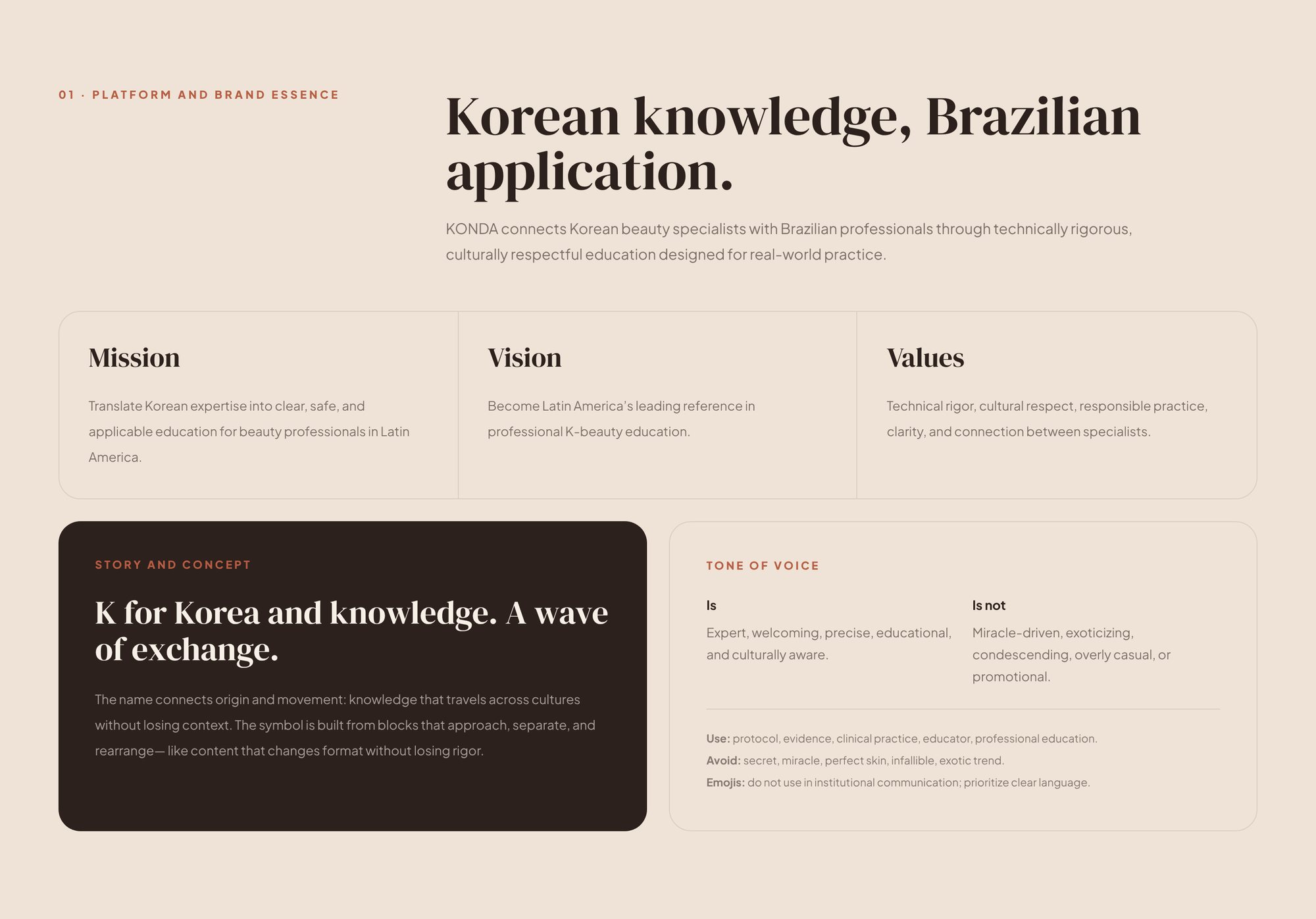
Korean knowledge, Brazilian application. Mission, vision, values and a tone of voice that is expert and close.

02Mini brand manual
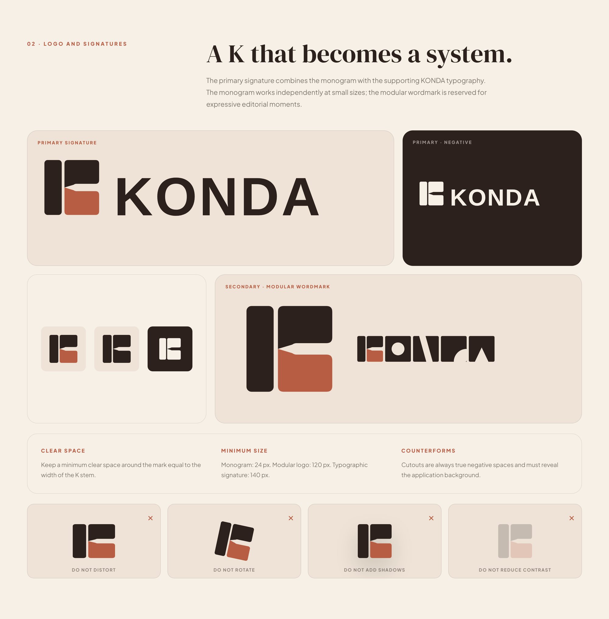
Three modules lock into one square, the way Hangul letters stack into a syllable. Signature, icon and seal come from the same blocks.

03Mini brand manual
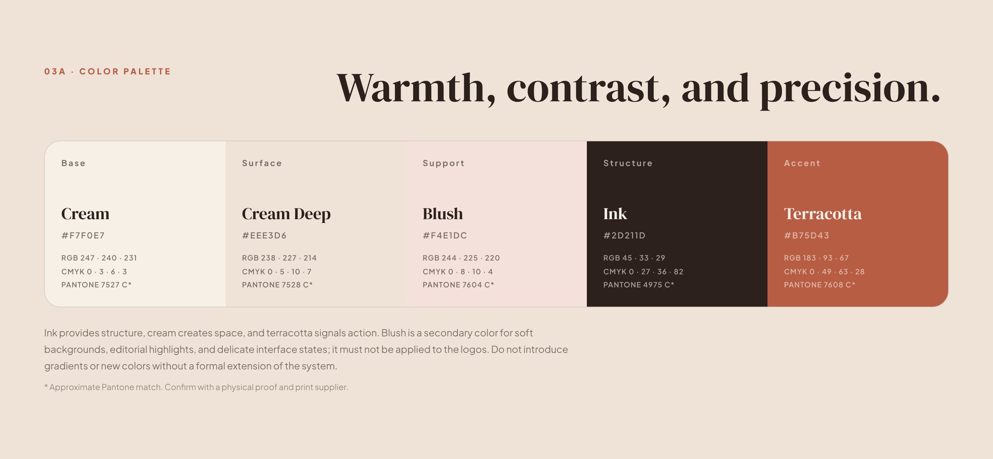
Cream for space, ink for structure, terracotta only where she should act.

04Mini brand manual
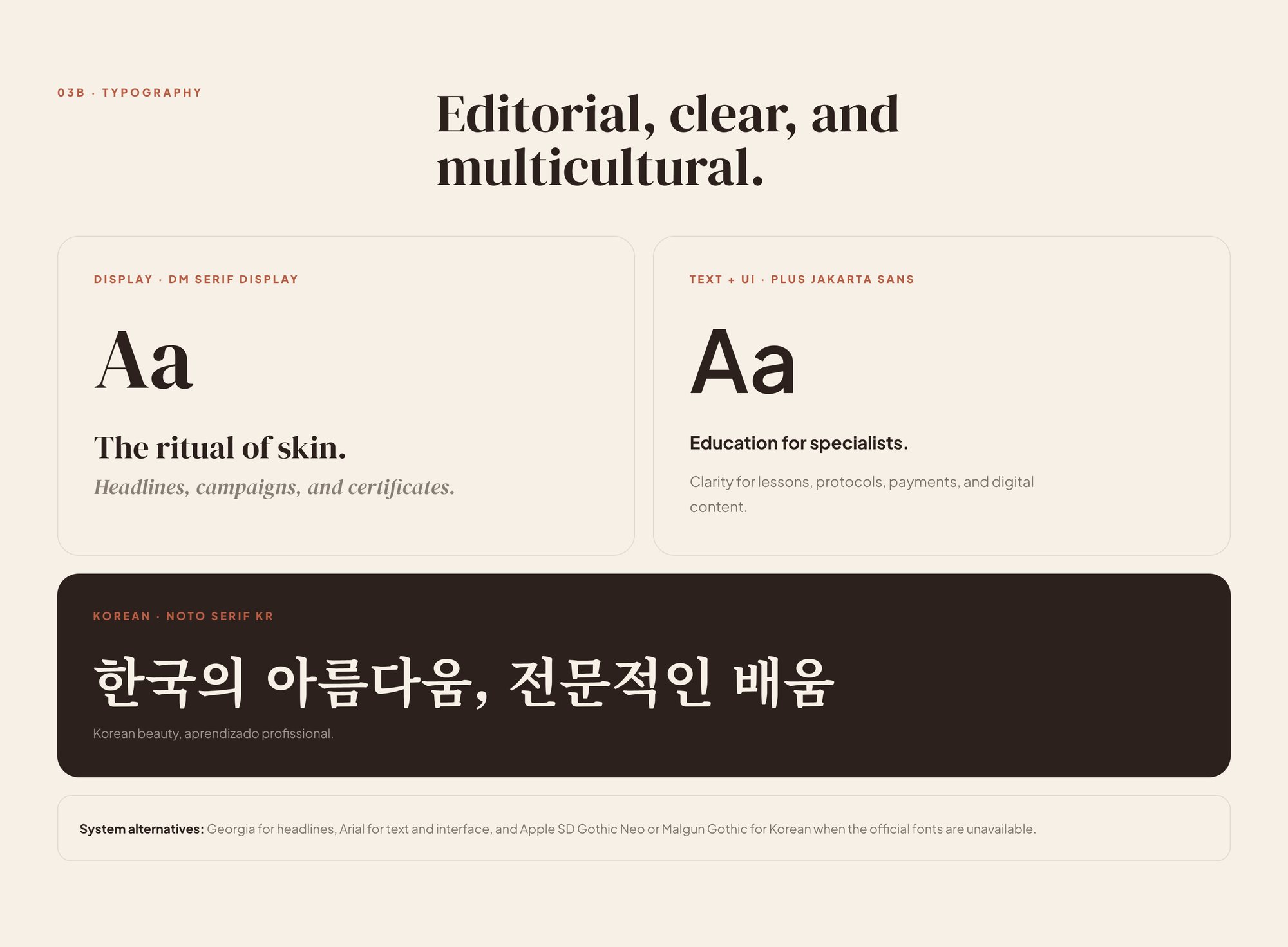
An editorial serif, a clear sans and a Korean serif, so Portuguese and Hangul read as one family.

05Mini brand manual
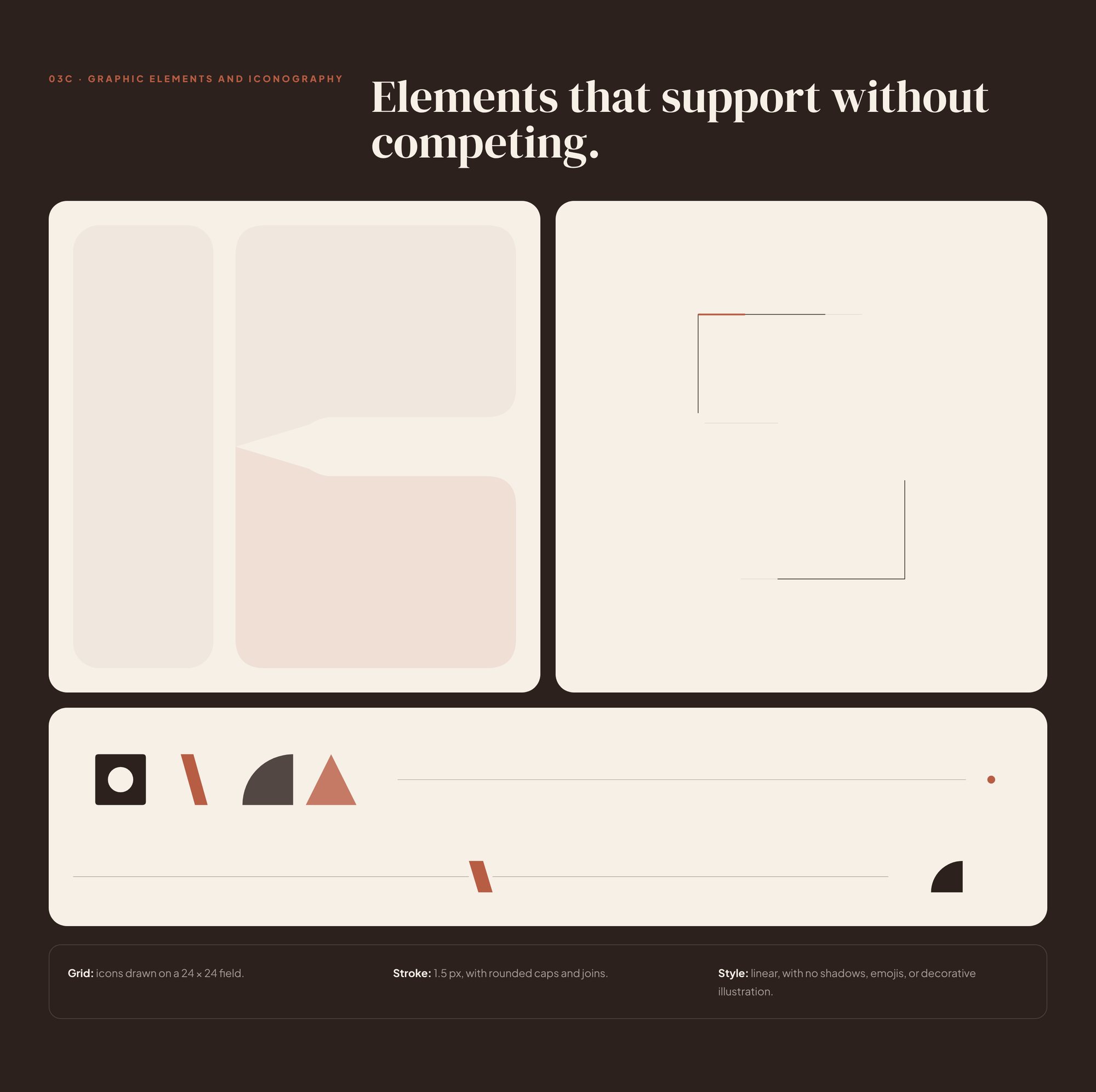
Frames, bands and dividers built from the same modules as the K.

06Mini brand manual
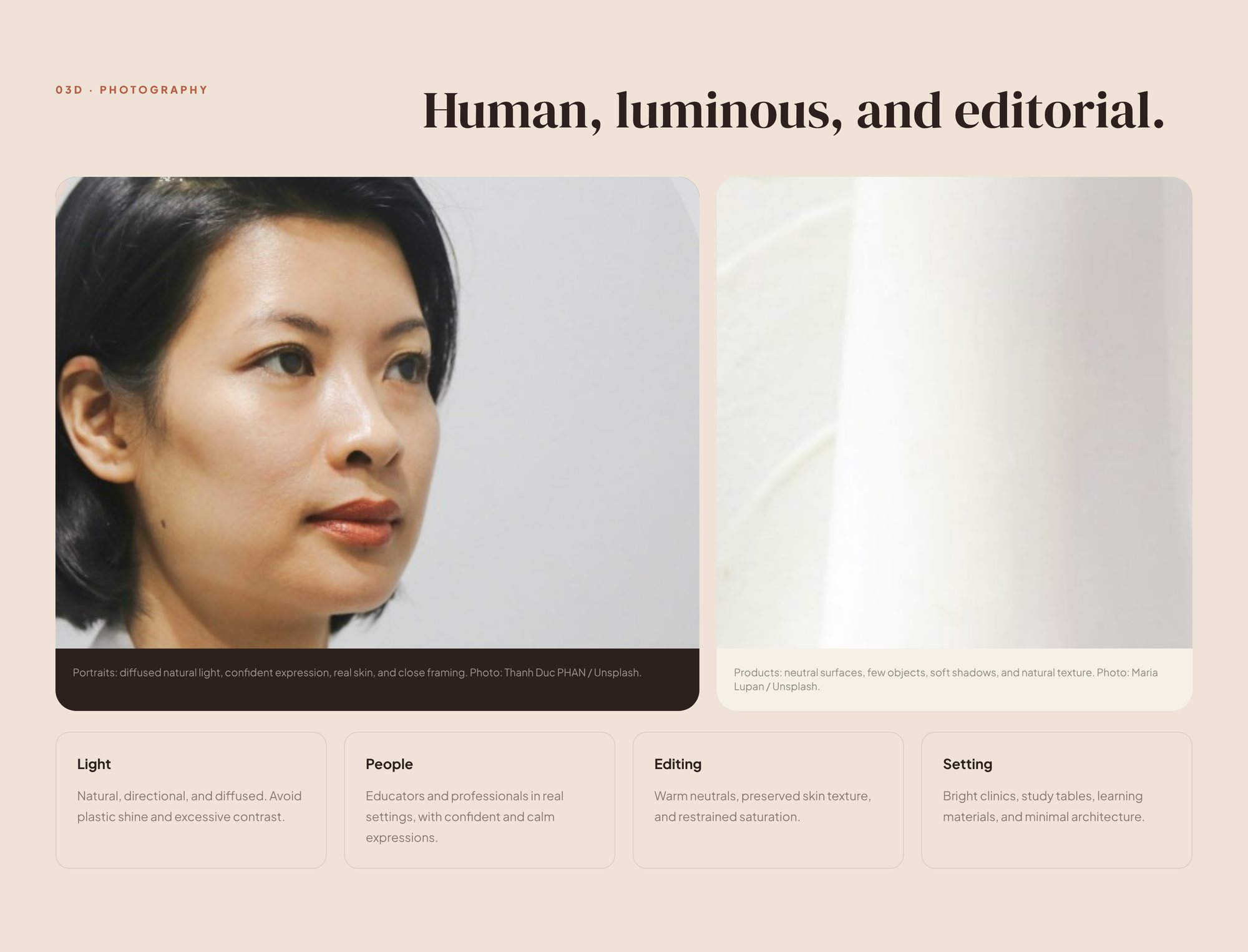
Human, luminous and editorial. Real skin, soft light, calm settings.

07Mini brand manual
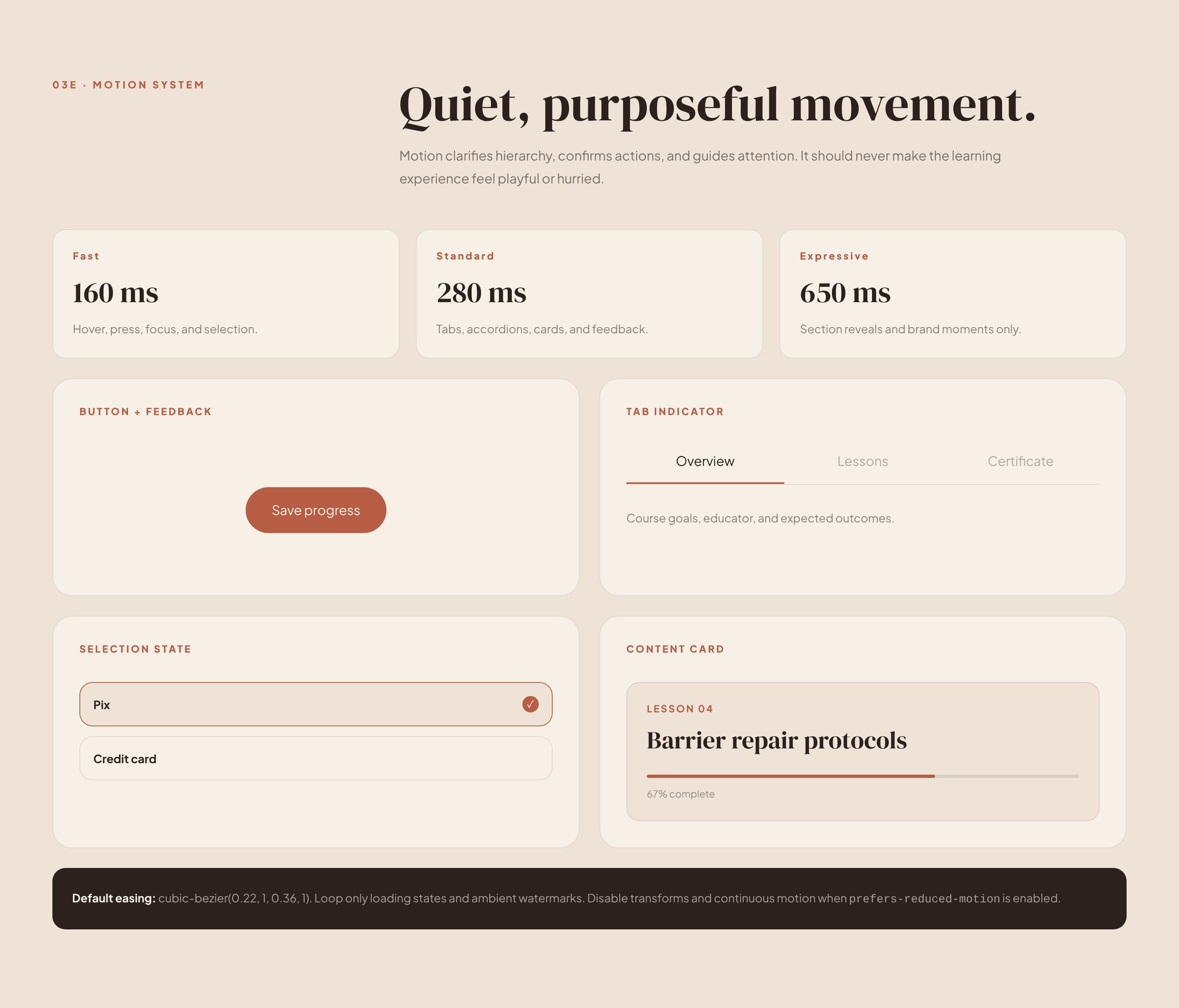
The blocks open and close with quiet, purposeful movement.

08Mini brand manual
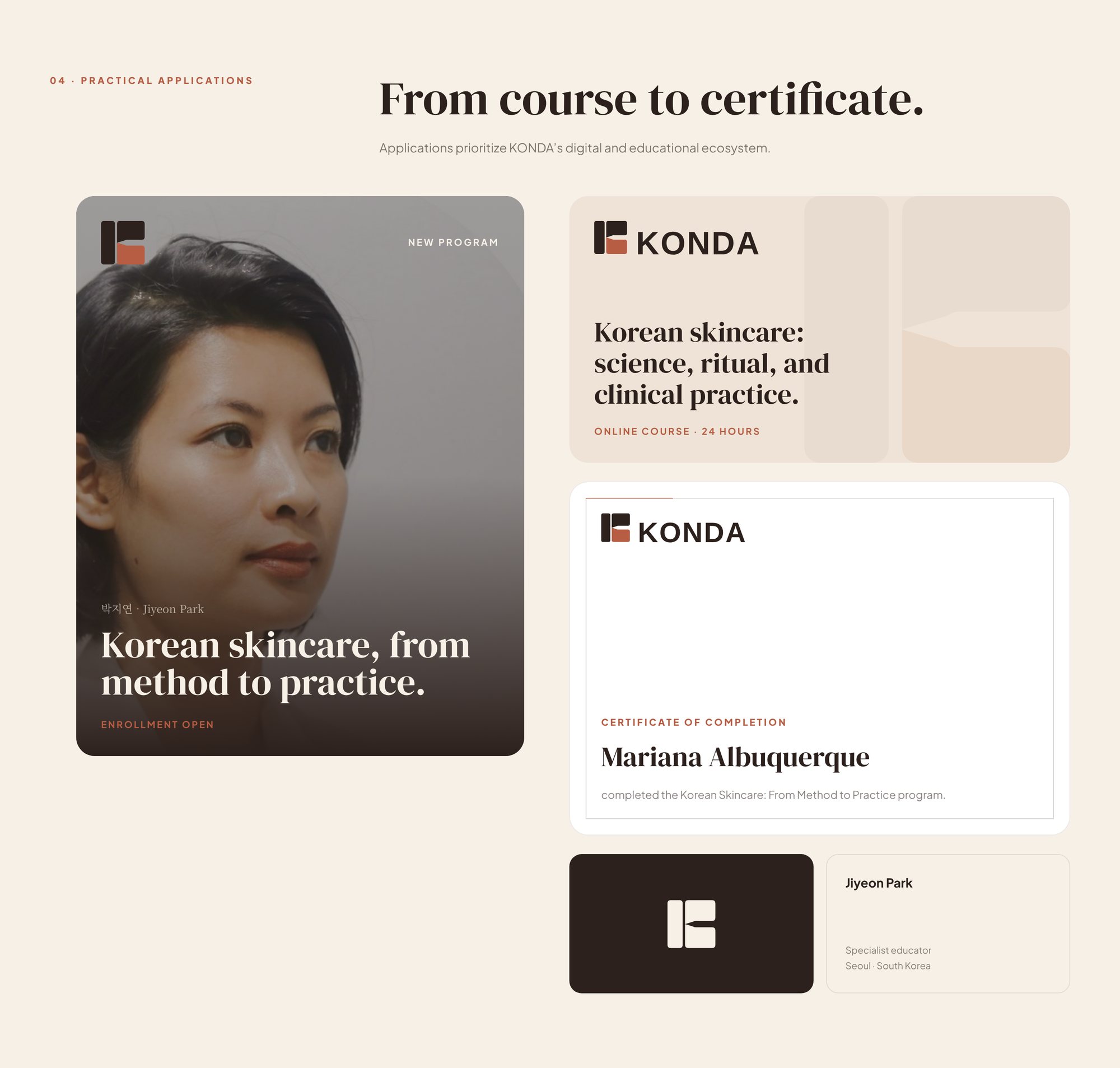
Course cover, banner, certificate and business card.

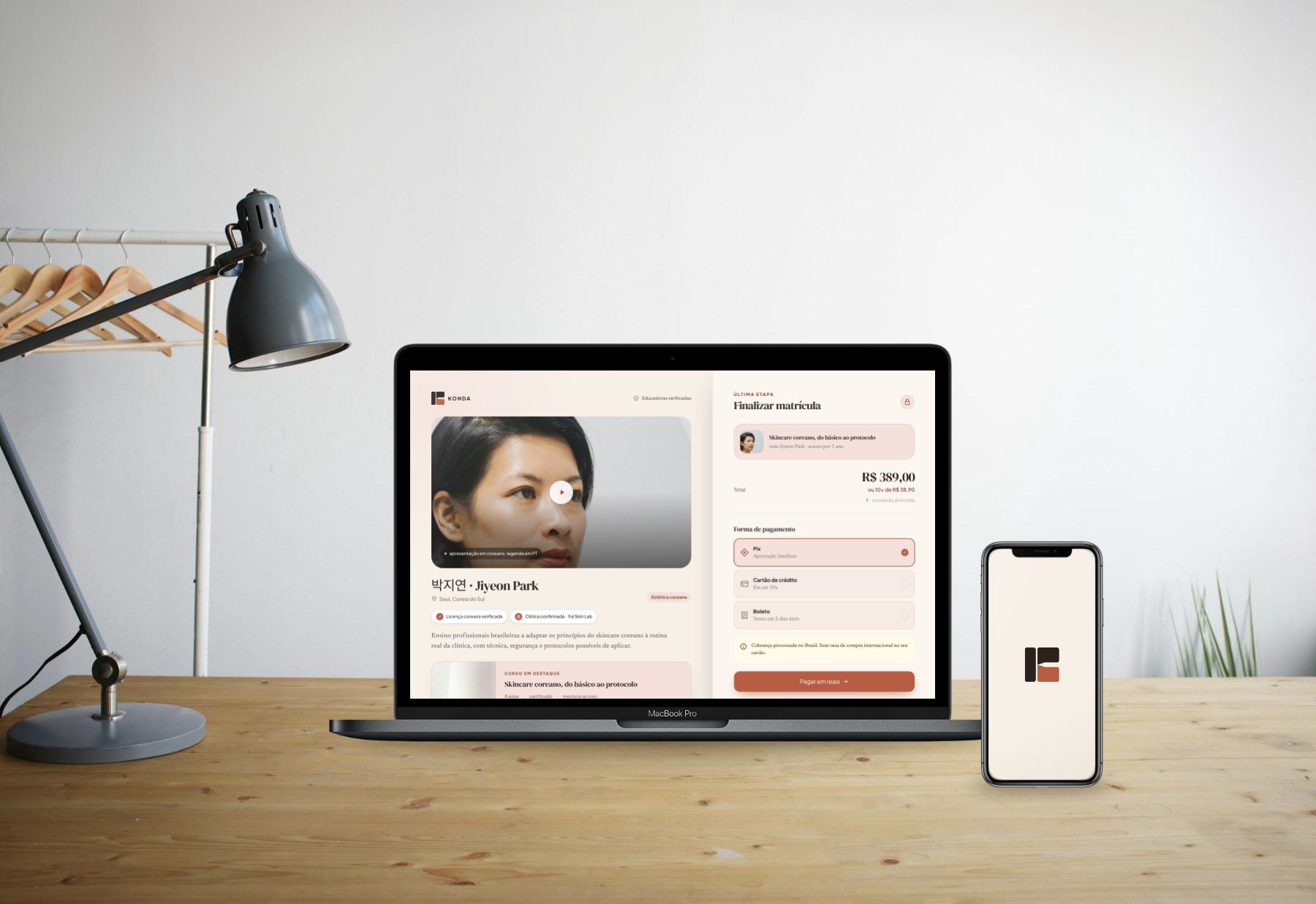
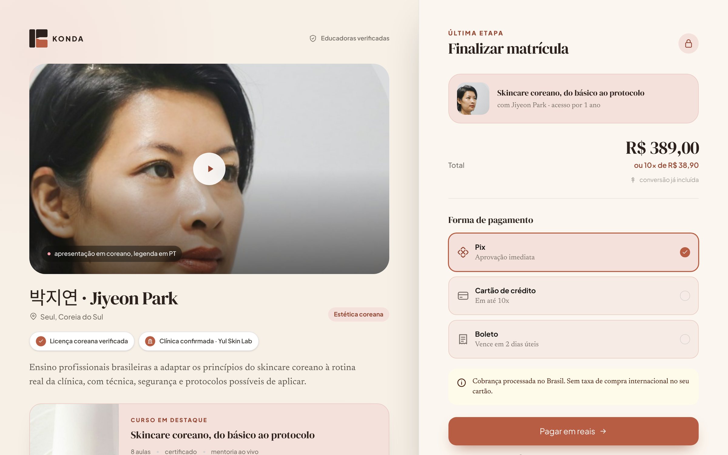
Her face and her verified Korean license first, then a checkout that closes in reais.

Two concept feed ads for Brazil, one leading with the educator and one with the course. Made for this case, not run as paid media.